
Table of contents
What is workforce reporting & why is it important?
Workforce reporting and analytics involves the analysis and interpretation of data related to an organisation’s workforce to gain valuable insights into its composition, performance and potential areas for improvement.
What workforce metrics should you be tracking? Well, it really depends on your organisation and it’s particular needs. Here’s a list of important metrics that most businesses use to help them understand their workforce:
- Position count: Quantifies the total number of roles within the organisation, providing an overview of its structural complexity
- Full-time equivalent (FTE) rollup: Assesses the total workforce in terms of full-time equivalents, offering a comprehensive view of labor resources.
- Open positions: Highlight job vacancies that may impact productivity and necessitate strategic hiring initiatives.
- Span of control: Measures the number of subordinates reporting to a manager, influencing organisational structure and managerial efficiency.
- Average age of open positions: Gauges the time taken to fill vacancies, aiding workforce planning.
- Employee status: Reveal workforce composition, informing decision-makers about factors such as full-time, part-time, or temporary employment.
If you fail to conduct any workforce analysis, HR teams are left basing their decisions on gut feel instead of actual data. Most organisations have the data to report on these metrics, but their only way of accessing the information is by exporting it into spreadsheets that need lots of manual work and that produce ‘point-in-time’ reports that quickly becomes out of date.
By centralising you data from all your HR systems (payroll, employee and performance) and feeding it into dedicated workforce reporting software, you can automate this process and gain instant access to a comprehensive view of your workforce. The integration of these metrics enables businesses to make ongoing data-driven decisions that help to optimise resource allocation, enhance productivity and align workforce strategies with organisational goals.
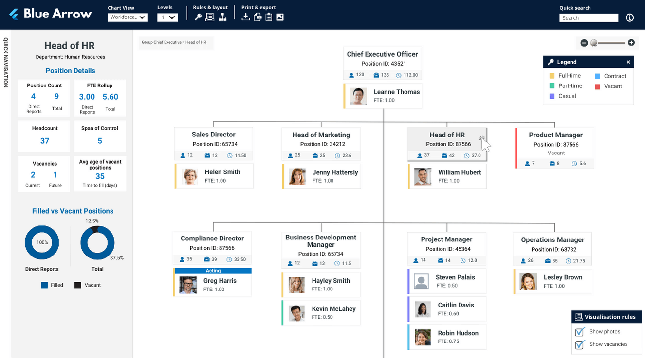
Workforce reporting chart example
If you’re looking for a best practice workforce report, below is an example of what it looks like in org.manager.
This template highlights who’s permanent or contingent, plus it gives clarity over important metrics like staffing levels, span of control and open positions.
Tip: This view can be completely customised based on your business requirements. Use visualisation rules to highlight key information that is important for analysis, or hide fields to reduce the amount of information shown on screen for a more focused view.
How workforce reporting software will improve your business
As HR is managing an enormous amount of workforce data, workforce reporting software helps by displaying essential information in visuals that can be easily understood at a glance.
Workforce reporting software allows HR to identify trends, monitor KPIs and predict workforce needs, through high powered data analysis. These insights are used to improve the business through staff retention, cutting costs and increasing company revenue.
Here are 5 ways that workforce reporting software will help to level up your business:
Enhance your structure: Knowing how many bodies are in the building is crucial when calculating budgets and analysing the effectiveness of your organisation. Metrics like span of control and position count help when making sure that your structure aligns with operational needs and strategic objectives, particularly for larger organisations with complex hierarchies.
Save money & optimise resources: Metrics like FTE rollup and position count allow businesses to better control labour expenses, optimise resource allocation and to identify opportunities for cost savings. Workforce metrics can also help to flag when employees are at risk of leaving, allowing you to proactively address workforce risks before they start to become a drain your organisation’s revenue.
Increase staff retention: Analysing employee status aids in understanding the composition of the workforce, facilitating targeted strategies for talent acquisition and retention. Metrics such as span of control help organisations optimise resources by evaluating managerial efficiency. This ensures that supervisors are neither overloaded nor underutilised, contributing to a more efficient and productive workforce.
Employee engagement & satisfaction: Understanding workforce metrics allows organisations to gauge employee engagement and satisfaction. By tracking employee status and other relevant data, companies can identify trends that may impact morale and take proactive measures to improve the work environment.
Improve compliance & diversity: Workforce analytics aids in monitoring compliance with Fair Work legislation. Additionally, tracking metrics related to employee status contributes to diversity and inclusion efforts, ensuring a balanced and equitable workforce.
Final thoughts
Tracking workforce analytics in a real-time reports is instrumental to promote efficiency, data-driven decisions and a healthy culture, ultimately contributing to sustainable organisational success and growth.
Navigo has 20+ years’ experience implementing successful workforce solutions across all industries in Australia. Book a demo today to discover how our portfolio of interactive HR reports will elevate the way you work.


