
Why are organisational charts important?
An organisational chart is a visualisation of your company’s hierarchy, showing your workforce structure as well as the relationships between org units, positions and individuals. Anyone who works in HR or the Executive team will understand that an org chart is a non-negotiable to ensure a sustainable and well-run organisation, no matter the industry or size.
If you’re in a small business, you can easily whip up and export an organisational chart using free tools like PowerPoint, Excel or Canva. But when you’re looking at mapping a larger workforce, it a whole lot easier (and quicker) to use software that can automatically generate an interactive org chart – especially when dealing with a complex structure.
So, how does it work? Generate a live org chart by connecting it to your payroll source of truth. That ensures that the data is always up-to-date and eliminates siloed data sets across the organisation.
Either set up a scheduled data upload or directly integrate your payroll system (plus other data sources) into the organisational chart software. Then you can securely share information that was previously unavailable to HR and Managers, with charts that will be automatically updated every hour, day or week.
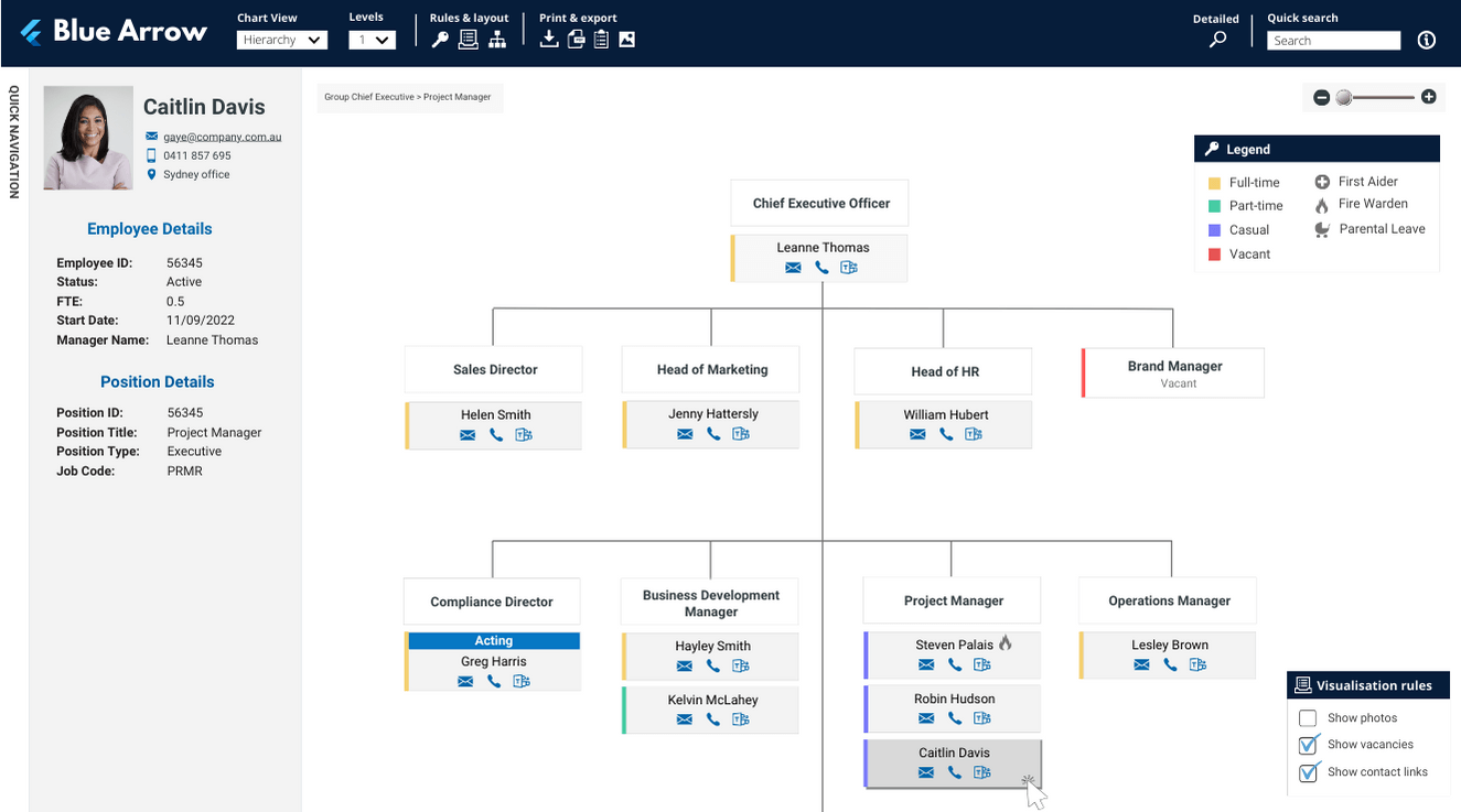
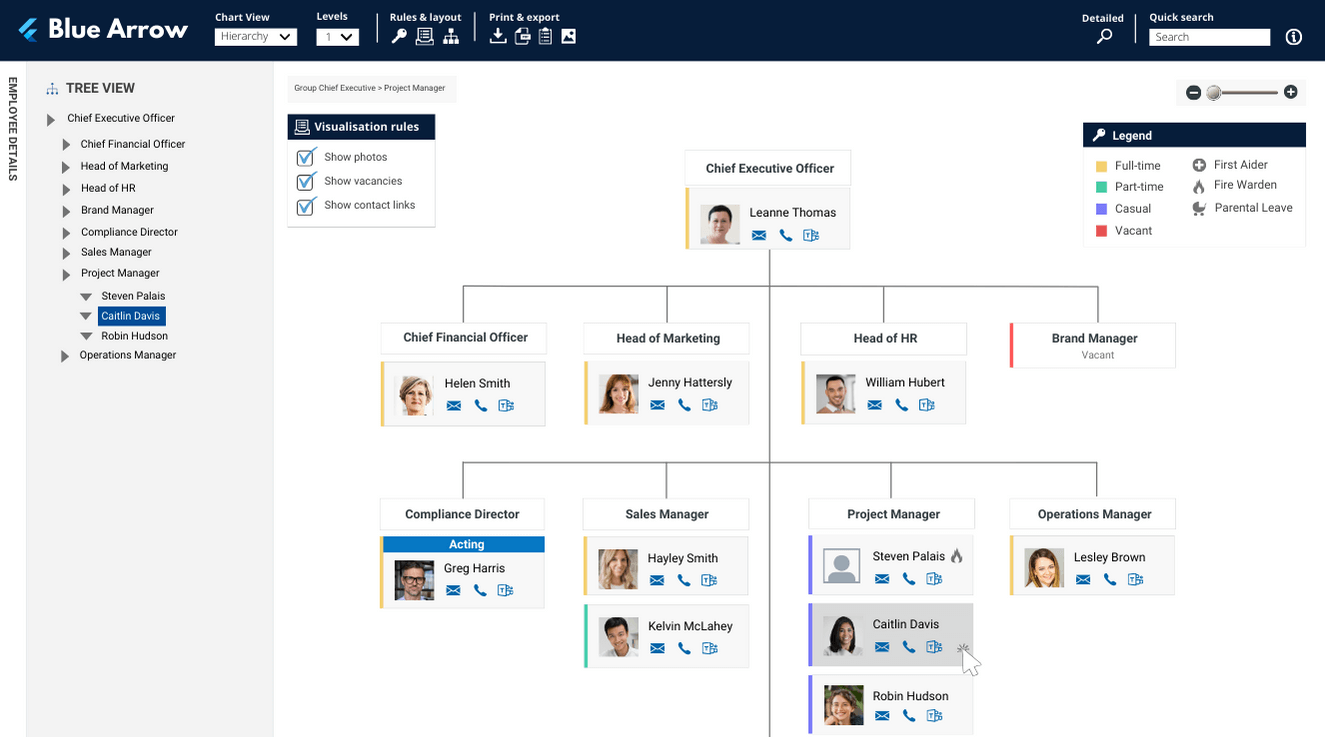
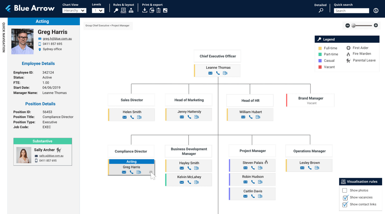
Organisational chart example
Organisational charts come in many shapes and sizes, but what does a best practice company organisational chart look like? Here’s an example of a simple hierarchy chart in org.manager, the leading org charting software:
Tip: When creating this chart, be sure not to cover too much ground. Try and make it as minimalist as possible with colour and information. E.g. an organisational hierarchy should only show information that can be viewed by all employees, use formatting to show/hide information to keep the design more focused. If you’re dealing with a large number of casuals or contractors, you can also combine multiple employees into one box – rather than a long list of boxes with employees in he same position.
5 ways an organisational chart will improve your business
A organisational hierarchy is generally the first view rolled out into an organisation. It provides all employees with a common understanding of where they fit in the hierarchy, as well as basic information about position attributes, location, contact details, photos, etc.
Good organisation charts allow you to see an accurate bird’s eye view of your organisational structure as it operates in the real world. Even basic org charts do a great job of drawing attention to important information, driving engagement and encouraging the exploration of answers.
Here are some ways that an organisational chart can help your business:
Productivity: A clear organisational structure can reduce confusion about roles and responsibilities and can eliminate the need for information requests by making it self-serve via real-time and easily exportable charts. Some studies suggest that well-defined roles and secure access to data can improve productivity by 10% to 30%.
Employee satisfaction and engagement: Employees who understand their roles and reporting relationships tend to be more satisfied and engaged. Research indicates that engaged employees can be up to 20% more productive.
Decision making: A streamlined hierarchy depicted in an organisational chart can expedite decision-making processes by up to 25% by reducing the time spent on unnecessary consultations or approvals. HR can deliver more insights into the business and its people, helping to earn their seat at the table.
Improved communication: Showing the relationship between positions and providing insights into the org hierarchy can reduce communication errors and delays. Studies suggest that well-structured communication within an organisation can increase efficiency by 20% to 30%.
Onboarding time: A clear organisational chart can potentially reduce the time it takes for new hires to understand the company structure and their role, potentially cutting down onboarding time by 15% to 20%.
It’s also a good idea to keep the future needs of the business in mind, rather than limiting the structure of an org chart to current workforce conditions. Use a flexible design that offers a picture of the entire workforce potential and can quickly address both current and future workforce changes.
Australian case study
A well-established Australian utility company (2,000 employees): Their People and Culture team recently completed a process optimisation review of their HR Technology and realised that hours could be saved every week by automating their organisation charts (they previously managed charts using PowerPoint). So they started exploring their options.
Navigo was selected because of the track record of successful implementations, agile working style and org.manager’s powerful configuration capabilities. Once implemented, their real-time org charts had a positive impact across the entire business.
“The Navigo team was extremely efficient and easy to work with. We found that org.manager was really good value considering the impact it has had on our organisation. Compared to other solutions, it’s priced very well.” HR Digital Systems & Business Insights Manager, People & Capability
Click here for the full story.
Final thoughts
Incorporating a simple yet powerful company organisational chart will improve how your business operates as well as helping you save significant time and money.
The Navigo team are also ISO certified, so book a demo today to discover how our portfolio of templates can revolutionise the way you work.


