
Harmonise data and automate org visualisation
Stop wasting time on box-drawing and Excel busywork. Integrate and centralise data from any system to power interactive workforce visuals.

 (14) (1)")
Trusted by over 500 organisations across the APAC region

 (1)")


What sets our solutions apart?
Our sophisticated dashboards and org charts will centralise all workforce data into one source of truth – aligning FTE and headcount metrics to ensure that everyone is on the same page.
Executive-ready charts in one click
Access polished, professional org charts that are always up to date and ready to share – guaranteed to impress executives.
See your structure – higher duties & all
Get real-time charts that accurately reflect your structure, including higher duties and secondments.
No more wasted hours on manual chart updates. Give your HR team time back to focus on higher-value work.
 (10) (1)")
Org visualisation feature favourites
Management dashboards for data-driven insights
Kill the spreadsheets and manual reporting. Give Managers access to workforce analytics dashboards to review current state and analyse trends. Gain confidence using instant reports across HR, Finance and Executive Levels.
 (41) (1)")
Board ready visuals
Use meaningful workforce analytics for post change reviews and ongoing assessment.
 (35) (1)")
From big picture into detail
See a high-level overview of your organisation & quickly drill down for more detailed information.
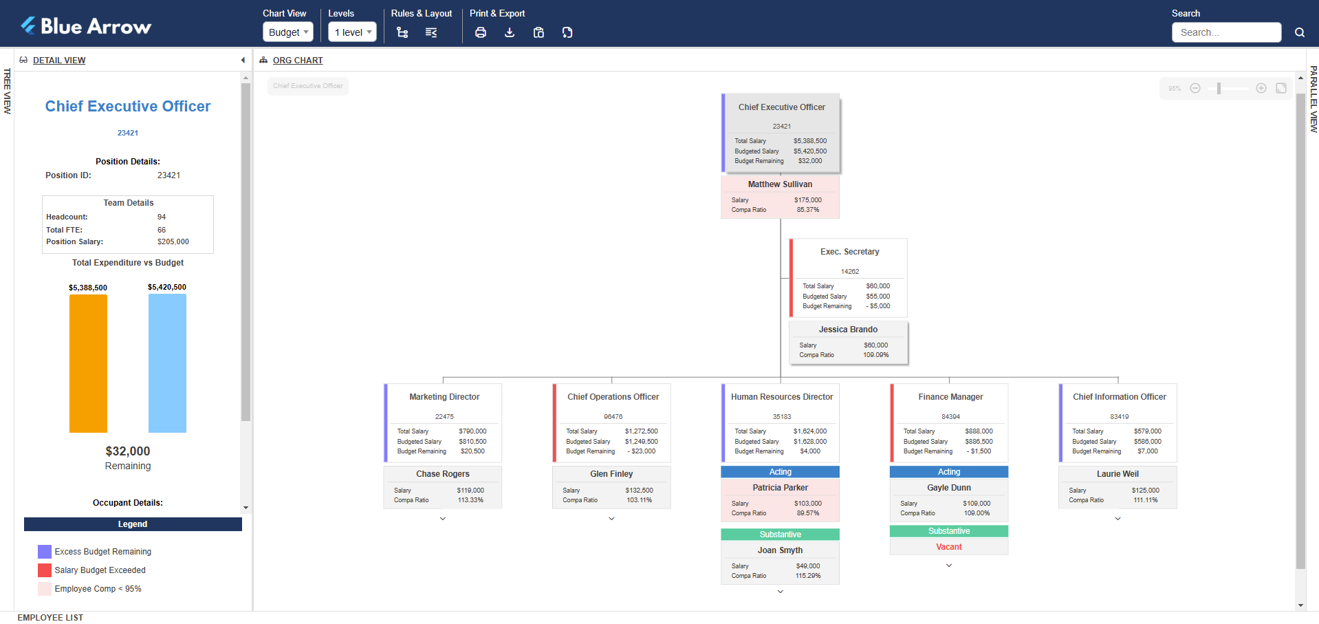
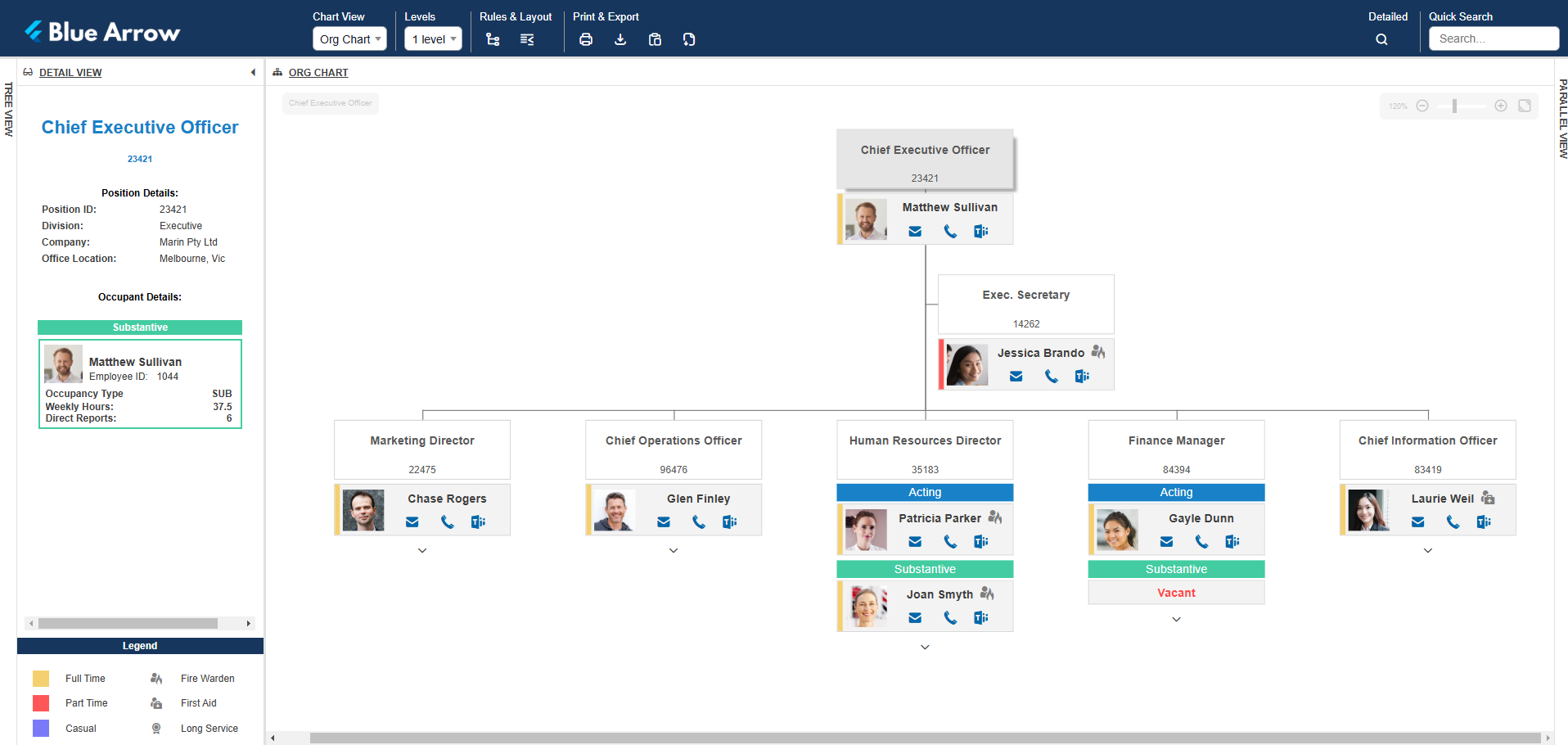
Real-time org charts powered by your HRIS
Break free from manual chart creation and formatting. Get instant access to professional charts including leave, position management, budget, salary, vacancy, diversity and spans and layers.
Automate org charts by integrating your HRIS (or multiple data sources), for an always accurate view of your workforce.
Customisable chart layouts
Full control over design, colour, hierarchy and layout. Pretty much anything you can think of, we can visualise!
Simplify complex structures
Visualise “real-world” reporting lines. Model matrix, concurrent, secondment, higher duties & team structures.

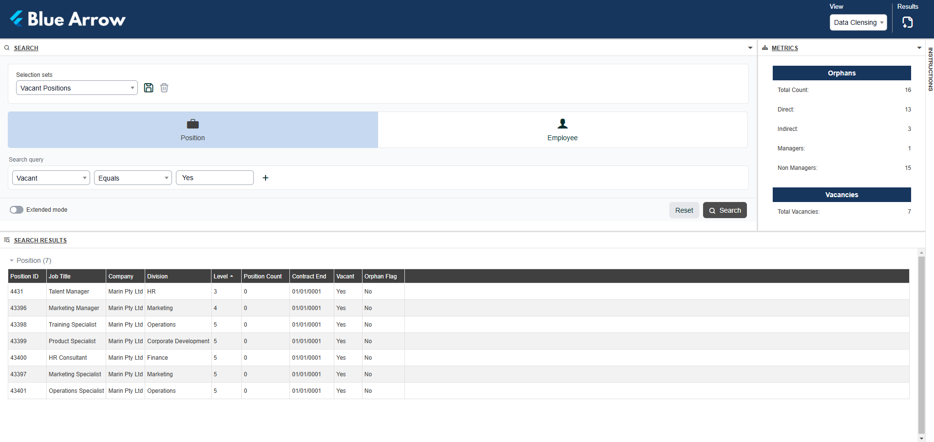
Data cleansing, made simple
Access reports that instantly surface missing data, duplicates or inconsistencies. Visualise based on your preferred way to work (e.g. list view or in a chart) and we can setup best practice business rules quickly clean up your data.
Give managers and employees secure access to their data, creating an ongoing data cleansing loop. This allows you to systematically improve data quality without the headache of a major cleansing project.
Over 20 years of solving workforce data challenges
We’re renowned for our data management and org design framework, which involves a hands on approach at every stage of delivery.
Learn about our workforce data consulting
 (4)")
The real-world impacts of org.manager
Crystal-clear workforce visibility
Move beyond static HRIS charts – our platform brings your entire organisation to life with dynamic visuals that make even complex structures simple to understand.
Goodbye manual admin, hello automation
No more wasted hours updating charts. With automated data integration and refresh, org charts stay accurate and up to date – without painful workarounds.
Insights that drive action
See the metrics that matter – headcount, vacancies, diversity, spans and layers – all visualised so leaders make confident, data-driven decisions.
Tailored to your organisation
Shareable, accessible, executive-ready
Empower managers and executives with one-click access to the information they need. Share charts, drill into details and report trends without ever touching a spreadsheet.
Explore org.manager
Whether you need a classic tree structure, a modern network view or dynamic dashboards with key metrics, get a customised visualisation that best fits your needs. Here’s some examples to give you an idea of what org.manager can do.
Data-driven charts
Instantly visualise hierarchies, KPIs and vacant positions with fully customisable and always up-to date org charts.
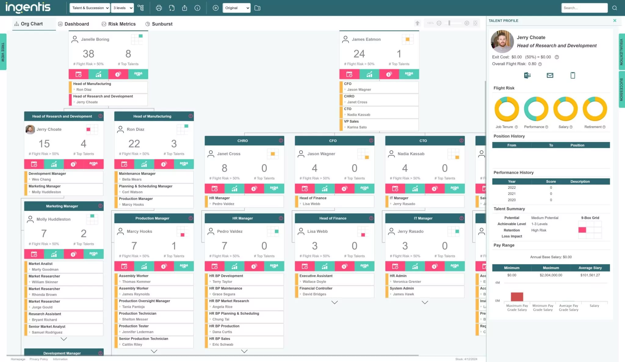
Key Positions & Talent Gaps
Keep an eye on critical roles, identify skill shortages and facilitate smooth leadership transitions.
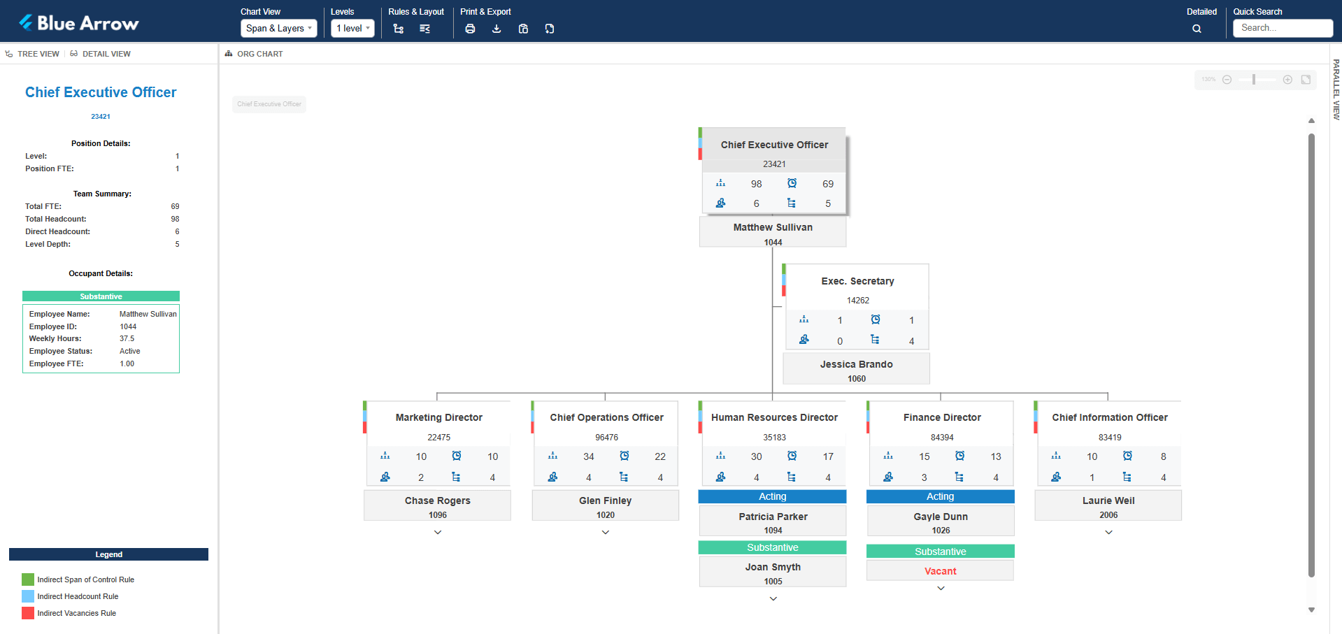
Span & Layers
See the number of management levels & the span of control to measure efficiency & identify structural complexity.
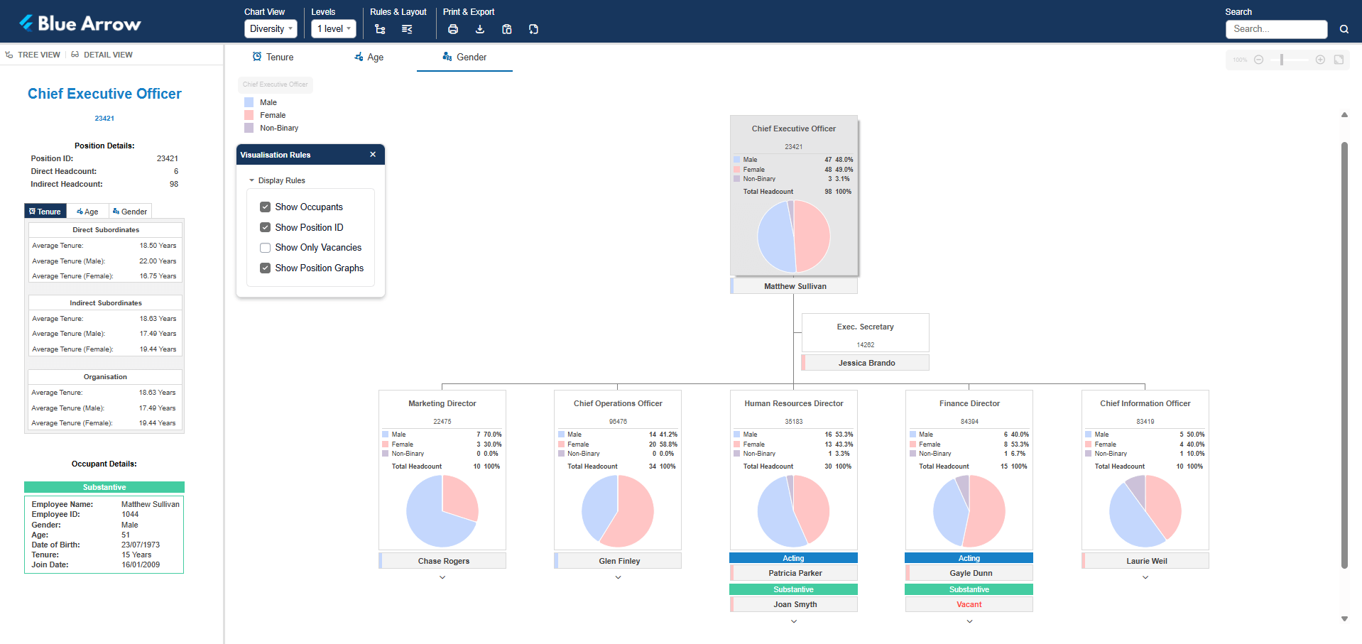
Gender Diversity
See the gender distribution across management, departments & job functions to identify inequities & track progress toward goals.
Data Cleansing Report
Instantly uncover duplicates, missing values, non-matching values, broken links in the data & ID anomalies.
Budget chart
Overlays financial data onto your organisational structure to analyse resource allocation & optimise spending.
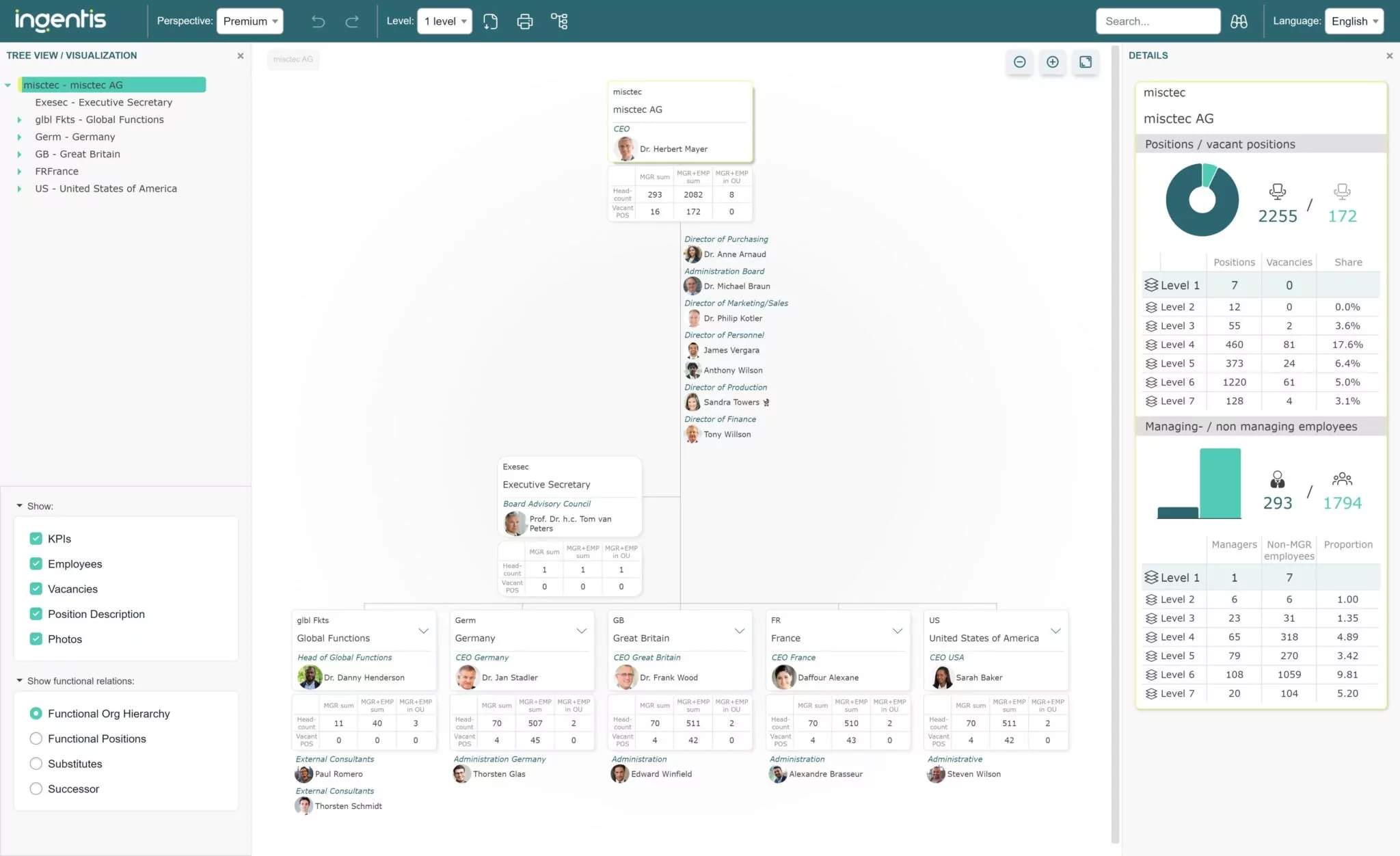
Organisational chart
provides all employees with a common understanding of where they fit in the hierarchy.
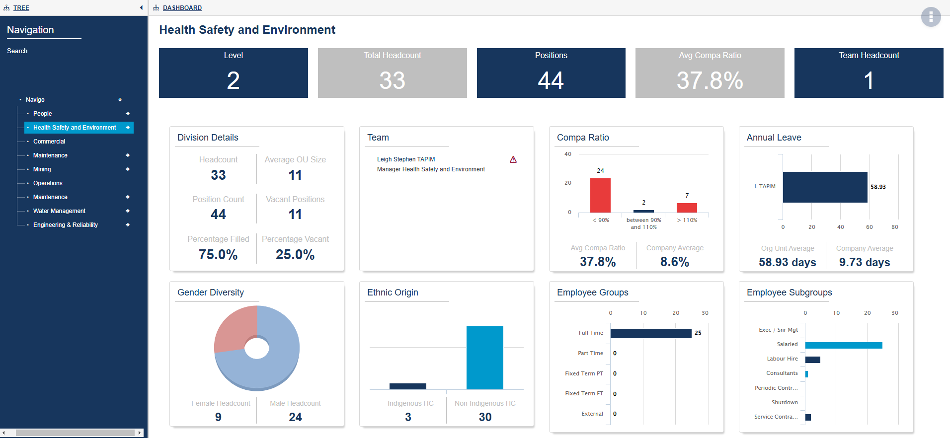
Organisational Dashboard
Visualise all of your important HR metrics in a single (up-to-date) view.
Org visuals with big impacts
Features that will help you harness your people data and reduce time consuming admin.
 (10)")
Complex calculations & rules
Create unlimited rules to toggle information to show or hide. Use slider functionality for easy analysis.
Easy access & sharing
Allow your team to securely access information using SSO. Share charts via an intranet link.
Add data
Enhance your charts by including data from other sources. Load direct or automate regular feeds.
Filter & search
Quickly find any employee or position. Filter charts by business unit, job family or custom tags.
Print & share
Intelligent exports produce perfectly formatted documents (PDF, CSV, XML, PNG).
Want a better way to analyse your workforce?
Discover more features that make your workforce data work for you.