Most organisations still rely on their HR team to manually manage org charts. And not just this – they’re managing endless data requests and manually creating workforce reports in Excel.
This is fine for small businesses, but if you’re dealing with 500+ employees – it quickly becomes hours of painful data admin.
It’s a no brainer to automate time consuming, tedious tasks. So why should your organisation charts and HR reports be any different? Here’s 4 ways that automating organisation charts and HR reports using software will help you lift your game.
1. Reduce unnecessary manual admin
Even if you take the time to pull data, manually translate it into an org chart or HR report – by the time you’ve completed the work, it’s probably out of date and can’t be used again. As well as this, you’re likely overqualified to spend your days in spreadsheets or drawing lines and boxes.
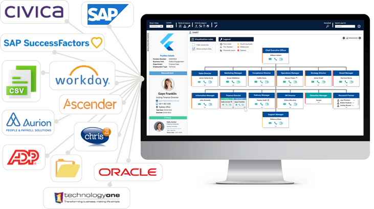
Make use of the data you have by either creating a scheduled, automatic upload or integrating your HR systems (plus other data sources) into an org charting tool. This will enable you to generate a live, accurate org chart with a click of a button, as well as give you access to a portfolio of useful HR reports.
Organisation charts display a wealth of information previously unavailable to HR, and the ease of creation means that these charts are generated every hour, day or week, instead of being manually created every few months.
More added perks:
- Effortlessly deliver up-to-date organisation charts as visual reports on a recurring basis
- Eliminate the need for the other departments to request information by giving them self-serve, secure access
- HR can deliver more insights into the business and its people, helping to earn their seat at the table
2. Leverage your employee data
You can’t make good decisions based on old data. According to best practice – all data in workforce reports should be:
- Made instantly available
- Automated
- On demand across the organisation
- Shared securely with appropriate access protocols (so that sensitive information is always safe)
The easiest way to do this is to make sure your data is constantly being verified, cleansed and kept up to date. From there, you need to pull information from the current, live information – NOT a data export, not the last report you made, and certainly not last year’s results.
If you’re not reporting straight from your source of truth, you’ll need to make sure your reporting tools are pulling data from the source of truth regularly.
Org charting tools, like org.manager, allow you to combine workforce data from any system into one place, visualising the information in a way that’s useful across the entire organisation. Most of our org charting customers set daily data refreshes so they are making decisions based on today’s information.

3. Improve visibility over your workforce
Good organisation charts allow you to see an accurate bird’s eye view of your organisational structure as it operates in the real world. Even basic org charts do a great job of drawing attention to important information, driving engagement and encouraging the exploration of answers.
An org charting tool allows you to:
- Quickly navigate through all levels of your organisation, with the ability to drill down into detail
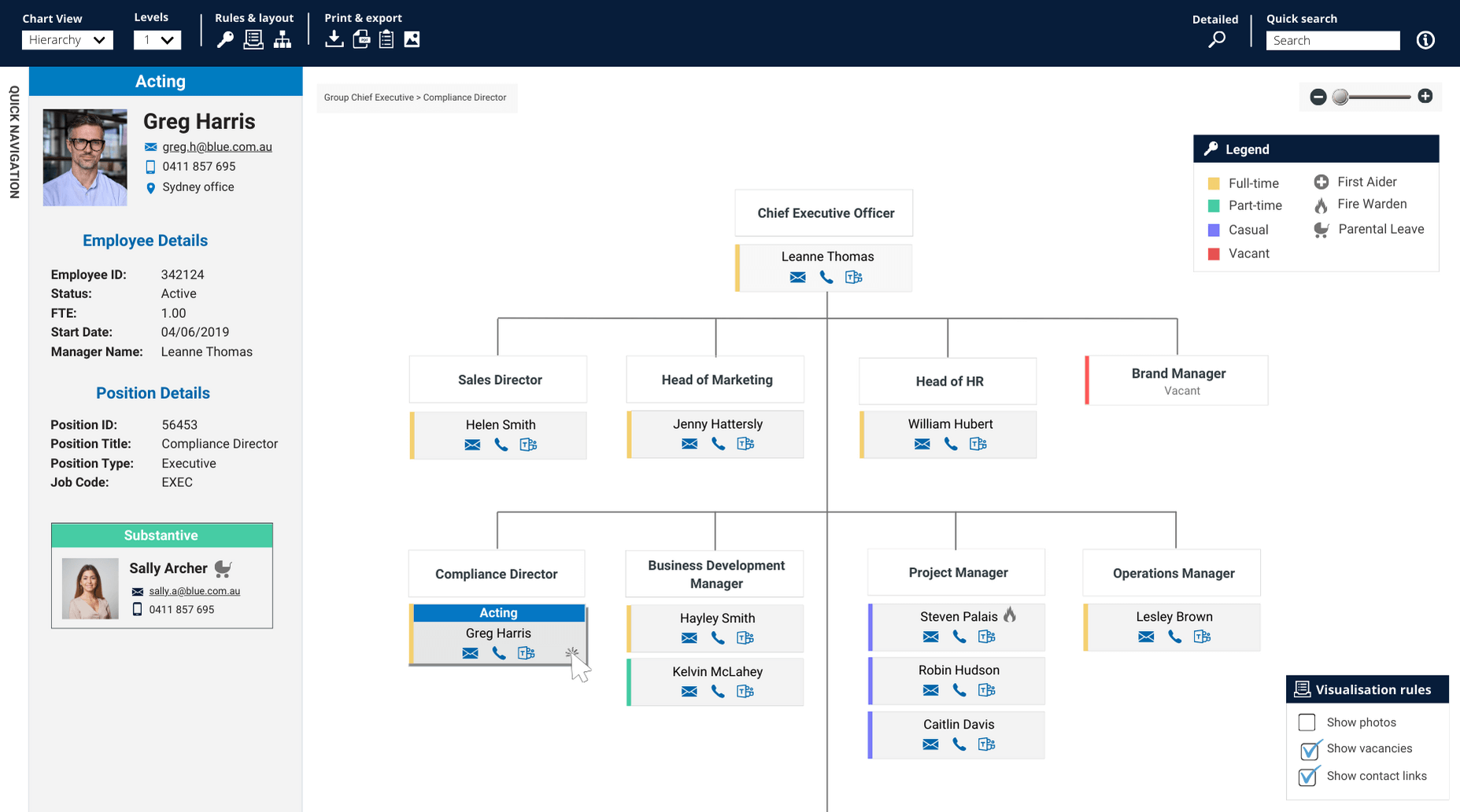
- Accurately view your dynamic workforce by visualising secondments, higher duties, acting positions
- Make better use of your data, in a whole lot of different ways – they can visualise real-time HR metrics in both simple and complex perspectives
- Emphasise visualisation, rather than reports and tables
- Use visualisation rules that allow you to highlight important HR metrics
org.manager organisation charts are browser based, making it easy to access and share your structure. You can make your organisation charts visible to all employees, as well as restrict access to specific data and functionalities based on role or requirement.
A corporate directory is generally the first view rolled out into an organisation. It provides all employees with a common understanding of where they fit in the hierarchy, as well as basic information about position attributes, location, contact details, photos, etc. Here’s an example of a corporate directory chart that automatically updates with changes made in the payroll system, plus has advanced quick search and easy chart export to PDF, image, Excel or html link.

4. HR reports in one click
Managing workforce reports manually puts a huge strain on the HR & payroll team and significantly delays decision making for managers. Research in Australia has indicated that most organisations are still at a very basic level of HR reporting, using manual tools such as Excel and PowerPoint.
This is fine until you’re asked to source some complex HR reports under a tight deadline. If you’re prepared, these reports will already be prepared too. But for 95% of us, you’re either going to have to use old data or set your whole HR team to some fast data crunching to deliver on time.
Save yourself the headache and stress. Rather than manually preparing ad hoc reports over and over – automatically generate them direct from your HR systems and data sheets instead! This way you’ll have a portfolio of always up to date reports that you can securely share or export with just a click of a button.
What are some easy ways to create HR reports using organisation charts?
Visual alarms – Highlight any issues within departments, e.g. you can highlight any department that is over the set budget in red. That way, you can share the report to decision makers and they’ll instantly know which departments are over-budget at a glance. To make it even easier – we can set this up for you.
Conditional formatting – Set up rules linked to check boxes or user-based permissions to to show/hide information. If you have an org charting tool, you can also use advanced search or filters to surface important information.
Powerful calculation engine – Easy insights and metrics with individual and department roll up calculations based on totals, percentages, averages and lots more (this is configured by Navigo, customised to your business rules i.e. FTE).
Hot tip: When creating a report, be sure not to cover too much ground. Make it visually appealing and guide the viewer through the data. E.g. when preparing a budget report, make sure only budget information is shown. There’s no employee contact details, no performance data – just the information requested.
Want to see some examples of how we’re automating organisation charts with other organisations?
Download our free PDF whitepaper to see how the 3 key departments below use organisation charts to access to the metrics they need for fast and effective decision making:
- HR department
- Org change team
- Management / Finance
See automated organisation charts in action
We can show you exactly how automating organisation charts and HR reports could work for you. Learn about our flagship org charting and org design platform org.manager by booking in a demo. Key features include:
- On-Prem or Azure Hosted in Australia
- Single Sign On via your Active Directory
- Security & administration setup
- Active Directory integration
- Charting complex relationships
- All charts are configured during implementation to meet customer requirements using the data, objects and relationships available
Otherwise, if you’d like quick access to easy-to-use org charts – download the orginio 14-day free trial. The key data columns you’ll need to get started are: Employee name, Position Number, Position Number Report To. From there, you can include any other employee record data you store.


